Masonry layout with React and CSS Flexbox


Masonry layout is a popular style of displaying images in a grid-like structure where elements of varying sizes and heights are arranged in a way that creates an uneven or "staggered" appearance. This layout style gets its name from the resemblance to the way bricks are arranged in a masonry wall.
Unlike traditional grid layouts where elements are aligned in neat rows and columns, masonry layout allows for more flexible and dynamic positioning. Each element, such as images or text blocks, is positioned based on available vertical space, filling gaps and creating an overall visually balanced design.
This layout style is particularly useful when rendering elements of different sizes or aspect ratios, as it can accommodate items with varying heights and widths without leaving excessive empty spaces.
Implementation

Yes, I know there are a ton of masonry layout libraries out there, but I decided to reinvent the wheel and build a simple version using plain old React, JavaScript, CSS… and cats.
Here’s the big picture:
- Suppose we have an array of cat images and want a grid layout with 4 columns.
- Render the first 4 cat images in the array to “establish” the 4 columns.
- Every subsequent cat image will then always be stacked on the column with the shortest height.
Let’s start with CSS
Use Flexbox to style the container and column elements. The container parent vertically aligns the column elements to the top and renders them in a row. Each column element renders the tile elements from top to bottom. All column elements will occupy equal widths within the container element.
.container {
  display: flex;
  align-items: flex-start;
}

.column {
  display: flex;
  flex-direction: column;
  flex: 1 1 0;
}
Each tile element contains the img tag that renders a cat image of varying aspect ratios. The img tag will expand to 100% width while the height will adjust based on the given image’s aspect ratio.
.tile {
  margin: 0;
  display: inline-flex;
  position: relative;
}

.tile img {
  margin: 0;
  width: 100%;
}
What is the aspect ratio? In the context of images, the aspect ratio determines the shape and proportions of the image. It specifies how wide or tall an image appears relative to its size. By maintaining the aspect ratio, you ensure that the image retains its intended shape without distortion when it is displayed in different dimensions.
OK cool, let’s move on to JavaScript.
React, my old friend
In this example, I’m using the Cat API to serve me a list of cat images. Let’s wrap the AJAX request in a useEffect and store the data in the local state.
const [cats, setCats] = useState([]);

useEffect(() => {
  fetch("https://api.thecatapi.com/v1/images/search?limit=10")
    .then((res) => res.json())
    .then((data) => setCats(data));
}, []);
The data for each individual cat object looks like this.
{
	id: "THXQ9Nqie"
	url: "https://cdn2.thecatapi.com/images/THXQ9Nqie.jpg"
	width: 1080
	height: 940
}
Now, let’s suppose we’re displaying the masonry layout in 4 columns. We need to know the width of the container element on page load, which we will retrieve via containerRef .
We’ll then take the array of cat images fetched from the API and organize them into the columns that will render the most visually balanced masonry grid, which we will store in the columns state.
The columns state is an array of 4 object literals corresponding to the 4 columns, each of which has the height property that represents the total height of the column and a nested tiles array that in turn contains the cat objects to be rendered in that given column.
const NUM_COLUMNS = 4;
const containerRef = useRef(null);
const [columns, setColumns] = useState([]);
Lastly, this is the logic to execute the “big picture” steps laid out earlier. I commented on the key steps in the code below.
useEffect(() => {
  let columns = Array.from({ length: NUM_COLUMNS }, () => ({
    height: 0,
    tiles: [],
  }));

  // 1. iterate through each image
  cats.forEach((cat, catIndex) => {
    // 2. iterate through each column and identify the shortest column
    let shortestColumnIndex = 0;
    for (let i = 0; i < NUM_COLUMNS; i++) {
      if (columns[i]?.height < columns[shortestColumnIndex]?.height) {
        shortestColumnIndex = i;
      }
    }

    // 3. stack the current image under the current shortest column
    columns[shortestColumnIndex].tiles.push({
      catIndex,
      ...cat,
    });

    // 4. calculate current image's rendered height based on its aspect ratio
    const columnWidth = containerRef?.current?.clientWidth / NUM_COLUMNS;
    const tileHeight = (cat.height / cat.width) * columnWidth;

    // 5. update the height of the current column
    columns[shortestColumnIndex].height += tileHeight;
  });

  setColumns(columns);
}, [cats.length]);
Steps 1 and 2. As we iterate through each image, find the shortest column at each iteration to which we will stack the current image. This can be done by keeping track of the current height of each column (with the height property) and identifying the shortest one.
Step 3. Once we’ve identified the shortest column, push the current image to the column’s tiles array.
Steps 4 and 5. Calculate the rendered height of the current image by using the container element’s rendered width divided by the number of columns (in this case - 4) and the image's aspect ratio based on its actual height/width, and increment the column’s height property to reflect the new total height of the current column.
Finally, the HTML markup
The container element is assigned the containerRef variable, which gives us access to the element’s rendered width based on the user’s screen size. Then we simply iterate through each element in the columns array, key into the tiles property, and render the list of images in the appropriate columns as determined by the masonry layout logic above.
<section className="container" ref={containerRef}>
  {columns.map((column, i) => (
    <div className="column" key={i}>
      {column.tiles.map((cat) => (
        <div className="tile" key={cat.id}>
          <span className="cat-index">{cat.catIndex}</span>
          <img src={cat.url} />
        </div>
      ))}
    </div>
  ))}
</section>
Tada!
Here’s my CodeSandbox project to see the whole thing come together.
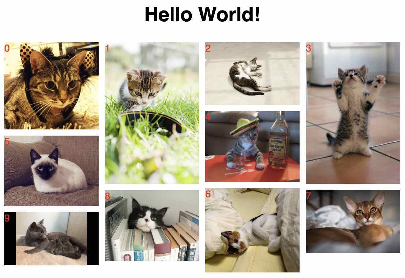
The original indices from the array of cat images are displayed so you can visually see how the masonry logic determines which column a particular image belongs to.
Thanks for reading. In a future(ish 😅) article, I may explore adding bells and whistles such as making the React component more reusable, dynamically updating the number of columns based on screen widths, or implementing infinite scroll.
Read More
 Liked what you've read?
 Follow me on LinkedIn!